
Analyzing Your Thumbnails: Five Thumbnail Mistakes Killing Your Views Revealed
In the vast ocean of online content, capturing viewer attention within the first few seconds is crucial. Thumbnails serve as the gateway to your videos, making them a vital component of your content strategy. However, many creators inadvertently make thumbnail mistakes that can significantly hinder their views. In this article, we’ll analyze five common thumbnail missteps and provide insights into how to correct them for maximum impact.
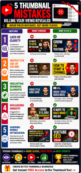
1. Lack of Clarity
One of the most prominent thumbnail errors is a lack of clarity. If your thumbnail is cluttered or confusing, potential viewers may not grasp the essence of your video at a glance. Aim for simplicity in design. Use bold, legible fonts and minimal imagery to convey your message effectively. A clear and straightforward thumbnail will help viewers understand what they can expect from your content.
2. Ineffective Use of Colors
The colors you choose for your thumbnail can have a dramatic impact on viewer engagement. Bright, contrasting colors tend to attract more attention, while dull or monochromatic palettes may blend in with the competition. Experiment with color combinations that complement your brand while ensuring the text stands out. Tools like Adobe Color or Canva can assist you in selecting the right color schemes that pop and draw eyes toward your video.
3. Neglecting Branding Elements
Your thumbnails should reflect your unique brand identity. Consistency is key in building brand recognition and viewer loyalty. Neglecting to incorporate recognizable elements, such as logos or a specific style, can lead to viewer disconnect. Develop a template that maintains a cohesive look across your thumbnails. This will not only help viewers identify your videos more easily but also establish authority within your niche.
4. Misleading Imagery
While it may be tempting to create exaggerated thumbnails to lure viewers in, misleading imagery can backfire. If your thumbnail does not accurately represent your video content, viewers may feel deceived, resulting in a negative impact on viewer retention and channel credibility. Always ensure that your thumbnail aligns closely with the actual content of your video. Authenticity will foster trust, leading to higher subscription rates and viewer loyalty.
5. Ignoring Mobile Optimization
In today’s digital landscape, an increasing number of viewers engage with content via mobile devices. Failing to optimize your thumbnails for smaller screens can severely limit your reach. Ensure your text is big enough to be read easily on a mobile display, and that essential elements are not cut off in thumbnail previews. Testing your thumbnails on various devices can help you determine the best format for mobile and desktop viewers alike.
How to Audit Your Thumbnail Before Publishing
Before publishing a video, take a few seconds to review your thumbnail using a simple checklist.
Ask yourself:
-
Can the image be understood in less than one second?
-
Is the text readable on a mobile phone?
-
Does the thumbnail create curiosity?
-
Does it accurately represent the video?
-
Does it stand out from competing videos?
Many creators spend hours editing videos but only a few minutes creating thumbnails. Since thumbnails directly influence click-through rate, they deserve the same level of attention as the video itself.
A thumbnail audit before publishing can help identify weaknesses that reduce clicks and prevent your content from reaching its full potential.
Conclusion
Thumbnails play a pivotal role in the success of your video content. By addressing these five common thumbnail mistakes—lack of clarity, ineffective color use, neglecting branding elements, misleading imagery, and ignoring mobile optimization—you can significantly improve your click-through rates and overall viewer engagement. Remember, your thumbnail is often the first impression viewers have; make it count!
Take time to analyze and refine your thumbnails, and watch as your views and engagement begin to rise. Happy creating!
Frequently Asked Questions
How do I know if my thumbnail is hurting performance?
A low click-through rate compared to your channel average may indicate thumbnail problems.
Should I change a thumbnail after publishing?
Yes. Many creators improve performance by updating weak thumbnails after a video is live.
What thumbnail element matters most?
Clarity is usually the most important factor. Viewers should instantly understand the visual message.
Are bright colors always better?
Not always. Contrast is more important than brightness. Your thumbnail simply needs to stand out from surrounding content.
How often should I test thumbnails?
Regular testing and refinement can help improve click-through rates over time.
Related Articles
Understanding Thumbnail Design: Five Thumbnail Mistakes Killing Your Views
Correcting Your Thumbnails: Solutions for Five Thumbnail Mistakes Killing Your Views
Why Nobody Clicks Your Videos
The Importance of YouTube Thumbnails That Get Clicks
Free YouTube Thumbnail Tool Review: Is This the Missing Piece Behind More YouTube Views?